Five Theme ProjectThis is my final theme project. The point of this project was to pick a theme and then use paint, pencil, chalk or whatever supplies you wanted to create it. I wanted to use one picture and make it with different types of mediums. Each one I made brought new challenges because with paint it is very easy to create layers with very similar colors and still be able to see the lines. But, with charcoal it was hard to make each part distinct. My favorite one was with acrylic paint and floating flowers.
|
|
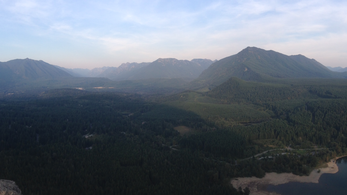
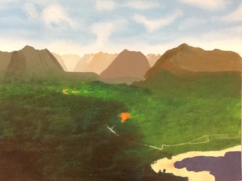
Landscape
|
This project was to paint a landscape. The picture I used was one I had taken from a hike up Rattlesnake. I like the way that my painting turned out. I think that I was able to capture the textures of the trees, and how the farther back the mountains go the lighter they get. Some things that could have been done better would be the colors. Even though they are similar to the colors in the picture they are lighter. Another thing that could have been done better would be the clouds in the sky. They dont blend very well, or have as much flow as the ones in the picture. But, overall I think that the painting is pretty good.
|
|
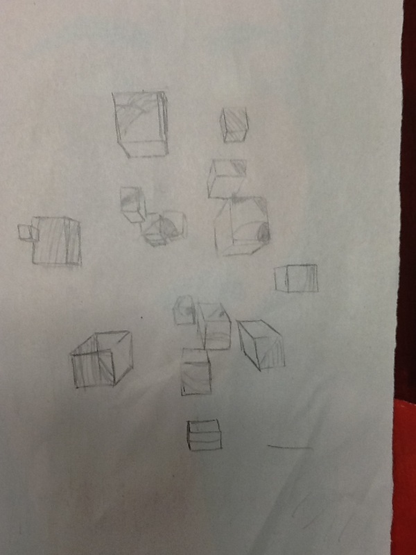
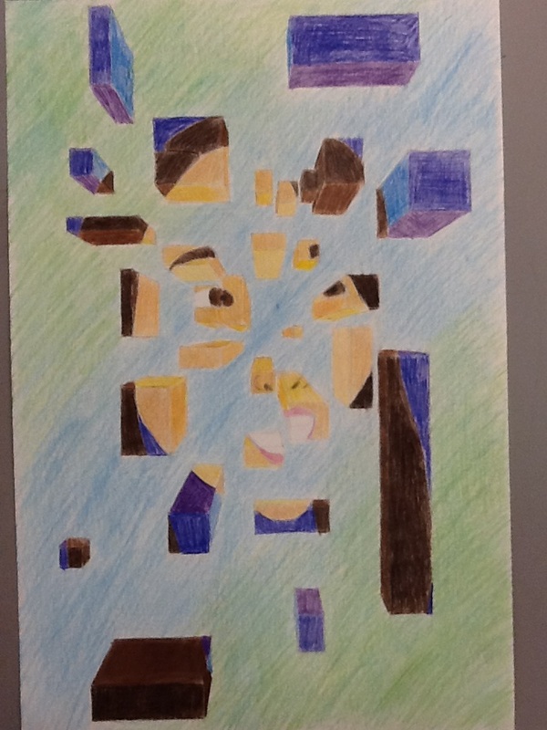
Broken Portrait
|
The point of this project was to create a fragmented looking self portrait with different sized blocks or cubes to create space, while at the same time using different values of each color to make it look 3D. My draft was pretty good. The portrait itself was good, but I didn't have enough blocks and so it was hard to tell what the image was, and a lot of the blocks were the same size. My final looked a lot better for a couple of reasons. One reason was that it had way more blocks around the outside of my face to show the shape, and more blocks on the inside to show the features. I also thought that I mixed up the sizes of the blocks a lot making them long rectangles or short boxes, wide or narrow. Some things i could have done better would have been to make the background one color. Another would be to differentiate between the values of colors more to have a more 3D effect.
|
|
|
Color Portrait
|
The first project that we were assigned was a self portrait painted in colors that reflect our facial expression. At first I didn't know what facial I wanted to paint because I hate taking selfies, I didn't know what face to make, and I didn't know what colors I should use. After a couple of self portrait drafts that were straight on I switched to a 3/4 view and that made drawing a lot easier, and then I found the expression that I wanted to make. I decided on an annoyed facial expression with the colors or orange, red, and purple. I think that for my first self portrait in a while it turned out better than I expected. I tried to make multiple shades of orange so that for my skin it wouldn't all be just one color. I also tried doing the same with the purple so that not all my features would be the same color. I also thought I did a decent job with picking out colors that reflected my facial expression. Some things that I could work on would be to make sure that some of m y facial features are the right size. One example is that one of my eyes is bigger than the other.
|
|
