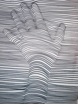
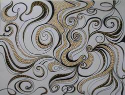
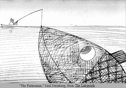
Line
is the most basic building block of formal analysis. Line can be used to create more complex shapes or to lead your eye from one area in the composition to another. |
Value
is the degree of light and dark in a design. It is the contrast between black and white and all the tones in between. Value can be used with color as well as black and white. Contrast is the extreme changes between values. 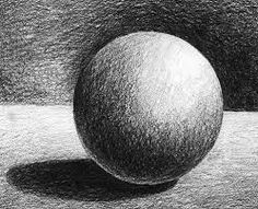
|
|
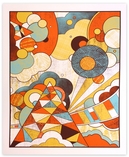
Shape
is created when lines are combined to form a square, triangle, or circle. Shapes can be organic (irregular shapes found in nature) or geometric (shapes with strong lines and angles such as circles, triangles, and squares). |
|
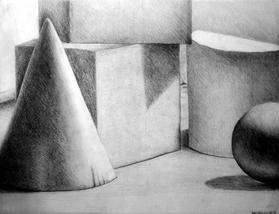
Form
is a three-dimensional shape with length, width, and depth. Balls, cylinders, boxes and pyramids are forms.
is a three-dimensional shape with length, width, and depth. Balls, cylinders, boxes and pyramids are forms.
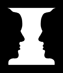
Space
is the area between and around objects. Increasing or decreasing the amount of space around an object affects the way we view that object. |
Color
differentiates and defines lines, shapes, forms, and space. Even black and white images have a huge number of different shades of gray. 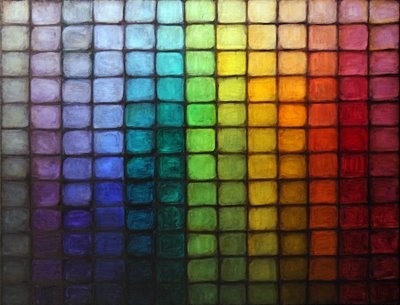
|
|
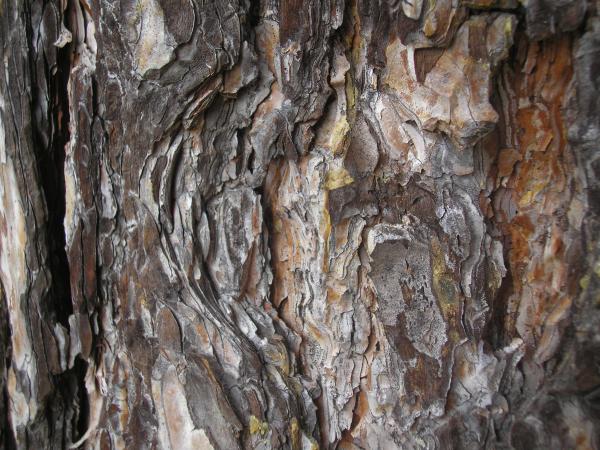
Texture
is the surface quality that can be seen andelt. Textures can be rough or smooth, soft or hard. Textures are often implied. For instance, a drawing of a rock might appear to have a rough and hard surface, but in reality is as smooth as the paper on which it is drawn. |
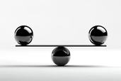
Balance
is created in a work of art when textures, colors, forms, or shapes are combined harmoniously.
is created in a work of art when textures, colors, forms, or shapes are combined harmoniously.
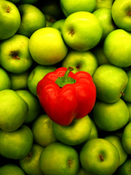
Contrast
is the use of elements of design that do not seem to go together to hold the viewer's attention and to guide the viewer's eye through the artwork by creating visual tension. In an image, elements that are quite different show contrast.
is the use of elements of design that do not seem to go together to hold the viewer's attention and to guide the viewer's eye through the artwork by creating visual tension. In an image, elements that are quite different show contrast.
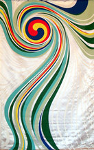
Movement
is the way a viewer's eye is directed to move through a composition, often to areas of emphasis. Movement can be directed by lines, contrasting shapes, or colors within the artwork. 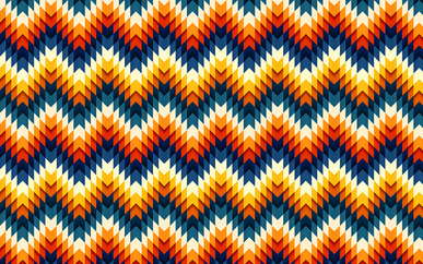
Pattern
is the repetition of a shape, form, or texture across a work of art. |

Emphasis
or focus is created in a work of art when the artist contrasts colors, textures, or shapes to direct your viewing towards a particular part of the image. Rhythm
is the repetition of pattern to create the expectation that the pattern will continue. 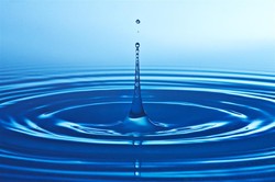
|
Proportion & Scale
is created when the sizes of elements in a work of art are combined harmoniously. Sometimes changes in Scale - making large things small or large things small - can change or perceptions.
is created when the sizes of elements in a work of art are combined harmoniously. Sometimes changes in Scale - making large things small or large things small - can change or perceptions.
Unity or Harmony
is created when the principles of analysis are present in a composition and in harmony - things go together. Some images have a complete sense of unity, while some artists deliberately avoid formal unity to create feelings of tension and anxiety.Unity is the other end of the spectrum from contrast.
is created when the principles of analysis are present in a composition and in harmony - things go together. Some images have a complete sense of unity, while some artists deliberately avoid formal unity to create feelings of tension and anxiety.Unity is the other end of the spectrum from contrast.
