Natalie's Art
Natalie's Art
  • Home
  • Intermediate Art
    • Process Blog
    • Finals
    • Drafts
  • Advanced Art
    • Sketch book
    • Blog
  • Ceramics
    • Working
    • Grading
    • Theme
    • Vocab
    • Gallery

Process blog

Abstract Music: Final

6/6/2013

0 Comments

 
Picture
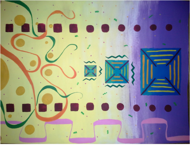
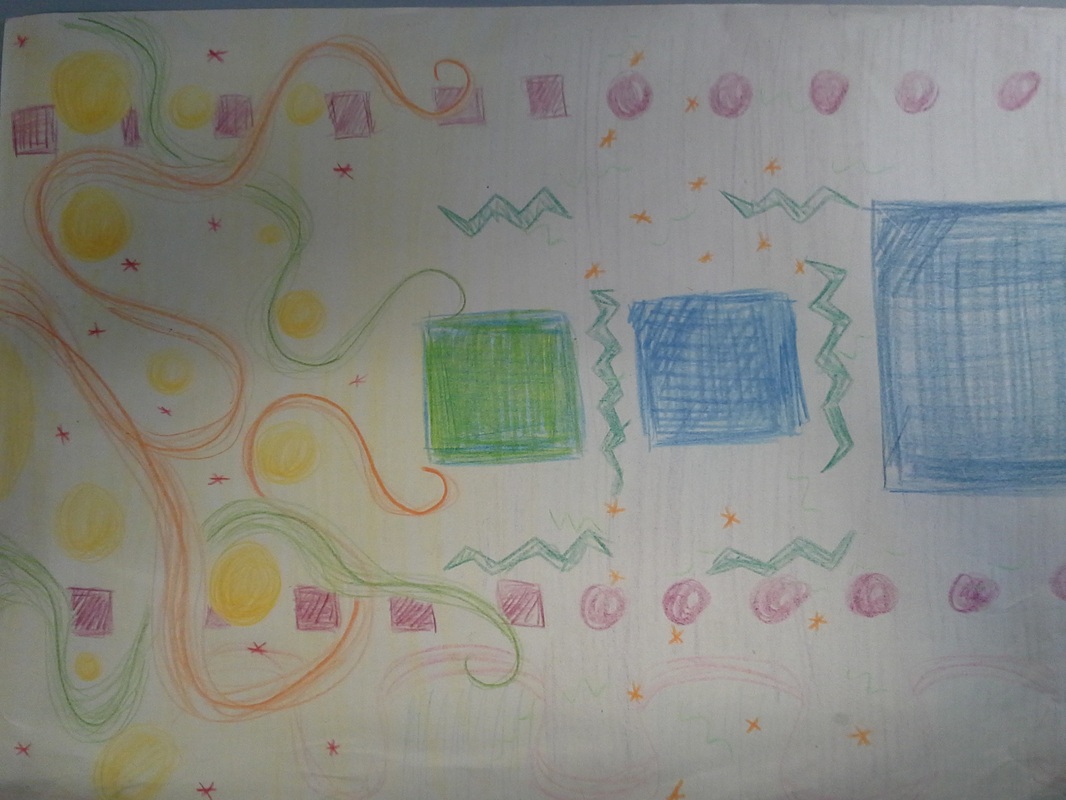
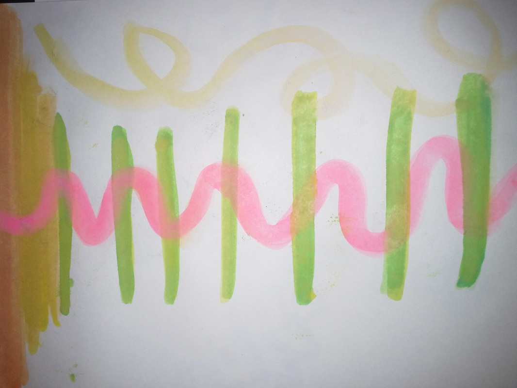
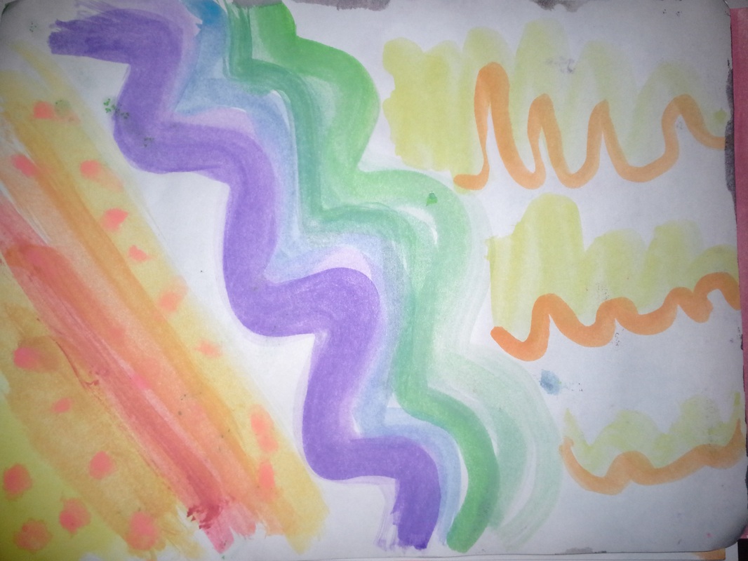
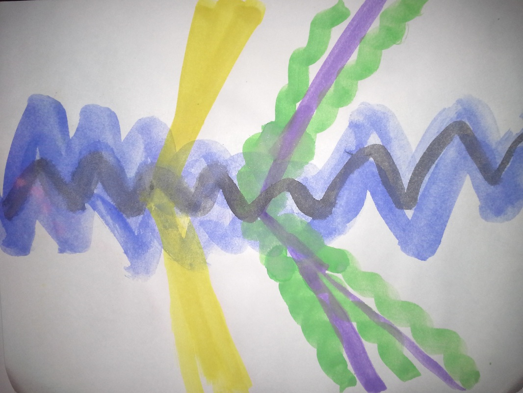
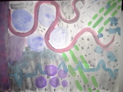
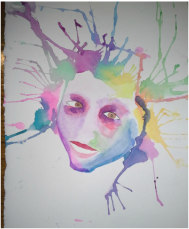
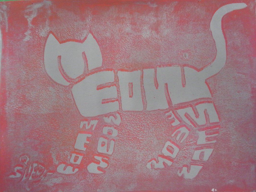
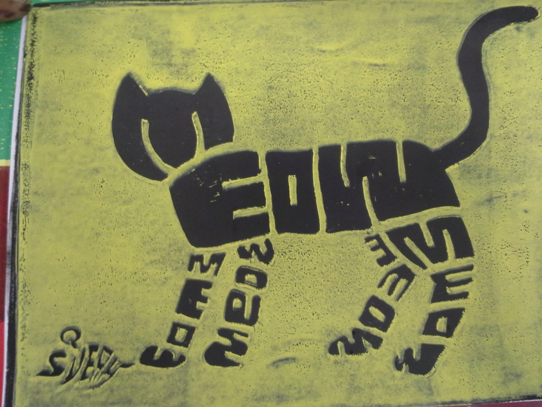
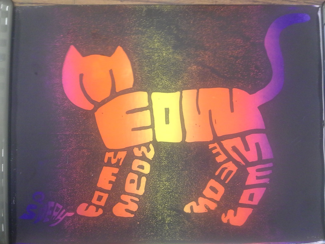
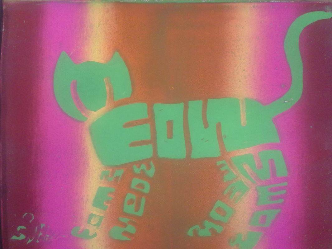
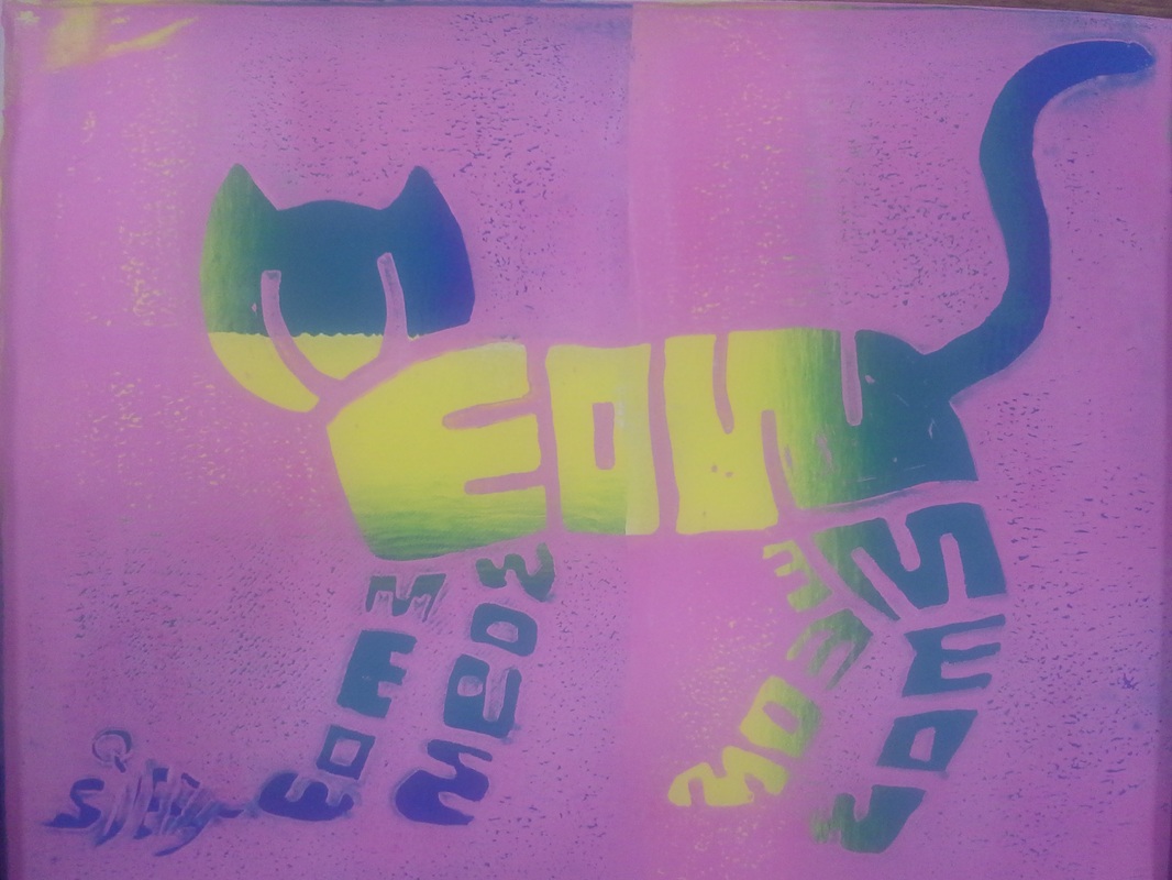
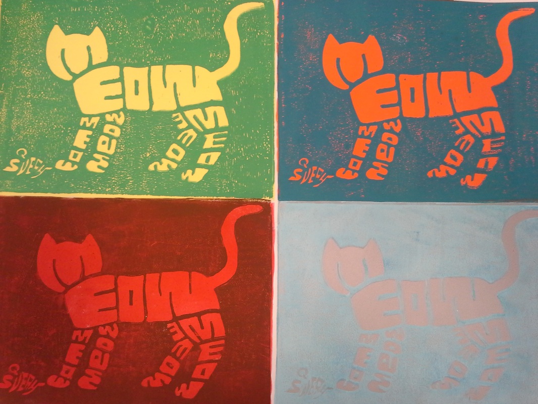
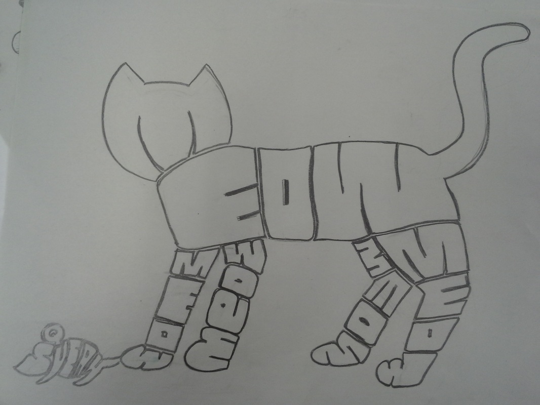
This Is my finished painting for music through art, I really like this because it turned out way better than I thought that it was going to in my head. While I like my draft more than the final because it was more detailed I like this because I think that it still captures the song in a way that was shown in the painting. Other than the actual painting I also think that the colors are matching the mood of the song.
0 Comments

Abstract Music: Song Choice

5/23/2013

0 Comments

 
Picture
This is my final draft. I really like this because I think that it represents the song well. I also think that the colors match the tone of the song and that the draft includes everything that it needs.

0 Comments

Abstract Music: Introduction

5/22/2013

0 Comments

 
These paintings are from the songs that we listened to in class. They aren't the best because we had just been introduced to the idea of painting music. But overall I think that I did better than I was expecting.
Picture
This is the first painting that I did, the order that I painted them is from left to right top to bottom

Picture
Picture
Picture
Picture
Picture
This being my last painting I thought that it was considerably better than the rest.

As you can see, the paintings are getting better the more that I did. While it's hard to say better because it's based off of individual interpretation of the song I still think that I captured the song better in the last one and started to understand better what I was doing. Also these were done in watercolor so they won't be as bright or vibrant as my actual final will be.
0 Comments

Acrylic: Abstract Music

5/21/2013

0 Comments

 
The point of this project is for me to pick a song and then paint what I hear. The one thing about this project though is that your not supposed to paint the words that your hear your supposed to paint the music itself. This means that the painting isn't going to be a painting of an object or place but rather of movement or sounds heard in the music.
0 Comments

Self Portrait: Final

5/17/2013

0 Comments

 
Picture
This is my abstract self portrait. I honestly don't know what to feel about this painting. I went a little overboard on the colors on my actual face, but probably didn't have enough of it around my face. I also could have done different colors because the colors that I chose don't look the best together. But overall I think that I did a decent job, and that even though it isn't the prettiest painting, that it still is what we were trying for.

0 Comments

Self Portrait: Draft

5/15/2013

0 Comments

 
Picture
This was my draft. I didn't finish it all of the way because mouths are hard to draw. Some things that could be changed are the proportions and placing of the features on my face. For example my eyes are a little far apart, and my face isn't quite the right shape. Other than those minor things though I think that it's a relatively good draft of myself.

0 Comments

Self Portrait: picture

5/10/2013

0 Comments

 
Picture
This is the picture that I chose for my self portrait. I chose this one for a couple of reasons, one of them was that it was one of the only pictures that I took because I find it awkward to take selfies. Another reason why I chose this was because it couldn't be a straight shot of my face, my head had to be turned slightly. Lastly I chose this because it has variation in the shading and lighting 

0 Comments

Watercolor: Self Portrait

5/9/2013

0 Comments

 
The point of this is to create a self portrait and then to paint it with water color. In the end it will be abstract because we will be painting it different colors and then putting more on and blowing the paint out. 
0 Comments

Printing: Fianls

5/8/2013

0 Comments

 
Picture
Picture
Picture
Picture
Picture
Picture
These are my finals for my printing projects. We needed 10 total prints so for the four together I tried to use the seasons for my color scheme. For the pair I tried pastels and for the remainders either used plain solids, or mixed in some rainbow backgrounds.
Picture
0 Comments

Printing: Ideas and Design

4/23/2013

0 Comments

 
Picture
These are my new ideas for the printing project. Initially I only wanted to do one cat, but I thought that it looked too plain by it's self. So I decided to add in a mouse that said "squeak". The mouse was squeaking because I decided to put the tail of the mouse under the cat's foot. I like this better than the original because it adds something else to the picture so it's not too plain  but not too much so that it's over the top. Plus it still makes sense.
Picture
0 Comments
<<Previous

    Archives

    June 2013
    May 2013
    April 2013
    March 2013
    February 2013
    January 2013

    Categories

    All

    RSS Feed

Powered by Create your own unique website with customizable templates.