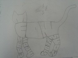
This draft was not my original idea that I was going to do. At first I wanted to do multiple cats and have them all meowing and then have one hissing. I thought that that was too much so I decided to only do one cat only made out of meows. Some things that need to be changed are the way that the legs are, because they look awkwardly placed, and they don't look like actual cat legs. Another thing that I need to change is the way thay the letters fot together and
The project is to create our own design on a block to use for printing. Unlike our last printing project in beginning art, we have to create an object that is made out of words contrary to just making a picture. So to do this I first needed to come up with an object that I wanted to use (which was a cat), and build off of that idea. and while I may have one specific idea in mind I can always change it as long as it's before the time that I need to carve out the block and start printing.
This is the arrangement that I came up with to use for my abstract shapes painting. I like this because of the variety of shapes given and that all of the shapes are placed at different distances so that they are not all really far away or close up. Another part that I like about it is that the shapes are layered in distance so that the sides that can be seen through would show another shape behind it. For this art project we need to take geometric or 3D shapes and arrange them to create depth and dimension. This is done through taking many different shapes and having all of the sides different colors or having parts or sides of the shapes open
Red Square:
Essentially for the red square I only used the colors Light Red, Dark Red, and Black to create the colors that I needed for that square. Orange Square: Light-Brilliant Orange, Light Red, Brilliant Red Medium-Light Red, Raw Sienna Dark- Brilliant Orange, Light Red, Black Ivory, Burnt Sienna Yellow Square: Mixes of Raw Sienna, Burnt Sienna, Light Green Green Square: Light-Raw Sienna, Titanium White, Raw Sienna, Light Green Medium-Light Green, Titanium White, Black Ivory Dark-Phithalo Green, Yellow, Black Ivory Blue Square: Light-Brilliant Blue, Black Ivory, Titanium White Medium-Phithalo Blue, Titanium White, Black Ivory, Dark Red Dark-Same as medium Purple Square: Light-Light Red, Dark Red, Deep Magenta, Medium-Deep Magenta, Light Red, Dark Red, Black Ivory, Titanium White, Violet Dark-Deep Magenta, Light Red, Dark Red, Black Ivory, Viloet These are the colors that I found from the magazines. I chose these colors because I thought that they all went together but at the same time showed contrast between each value and there was a big enough difference that showed in between each shade. It also had a wide enough range between the dark and the light to make sure that almost every color was withing the range. Some things that i could have changed was that not all of the colors that i made matched the The point of this assignment is to match colors of paints from samples of colors from magazines. So we were given a bunch of different types of magazines and would try to find different samples of colors, and would try to find three of each color to provide different shades of the same color. To do this, when I find color samples I need them to be similar colors just have different values. For example for green I would want a similar green for all of them just different values. This is because I don't want colors that don't go together for example pastel and neon.
This is my final for the large scale charcoal drawing. Overall i think that i did pretty good, but there are somethings that could have been better. For example some spots aren't even with the shading, and the holes in the top aren't quite big enough. But other than that I think that it looks good. I changed parts of it like on the surface of the headphone i curved the lines and didn't make it as dark as in the drafts and I think that improved the drawing too. I also think that I did well o These are my other drafts for my charcoal drawing. They are different from my last drawing because they are closer in on the object showing less of the overall object. I like these ones more than the other one because they look better and I figured out how to shade the background to not leave it plain. For my final some things that I'm going to need to work on is the light shading and the movement in the item so I can show how the object which is a pair of headphones is not just flat but round.
|
Archives
June 2013
Categories |